Ljubljana is a culturally rich European capital known for its historic architecture, riverfront charm, and iconic dragon symbolism. With so many recognizable elements, the opportunity was to create a tourism logo that brings the city’s identity together in a clear and modern way. The challenge was to design a mark that reflects Ljubljana’s history and personality while feeling fresh and welcoming to today’s travelers.
I explored cultural symbols connected to Ljubljana’s heritage and character, focusing on ways to translate them into a clean, contemporary visual language. The goal was to create a logo that feels timeless but flexible enough for modern tourism use. Through iteration and refinement, the final direction emphasizes simplicity, meaning, and strong visual presence.
Client: Lublijana
Project: Tourism Logo
Software: Illustrator
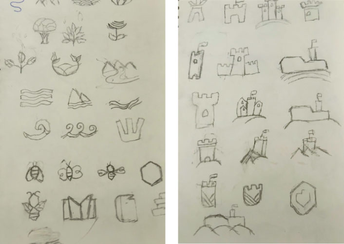
I began by exploring a variety of symbolic and typographic ideas inspired by Ljubljana’s landmarks and folklore. From this process, three main concepts stood out: the quill, the dragon, and the castle. Each offered a different perspective on the city’s identity, allowing me to compare tone, symbolism, and overall impact before selecting the final direction.
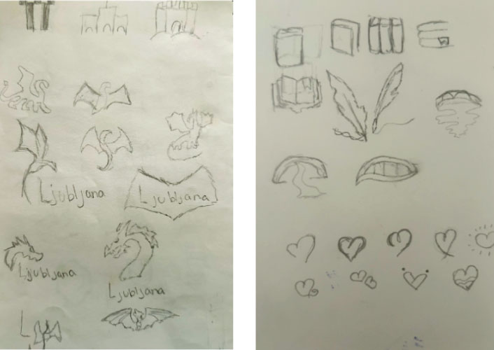
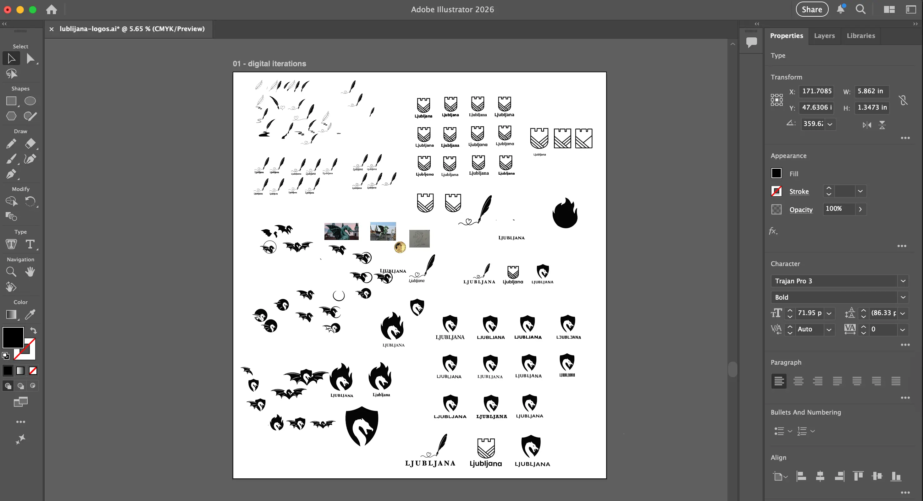

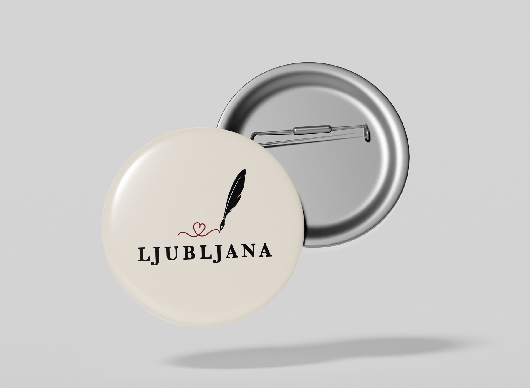
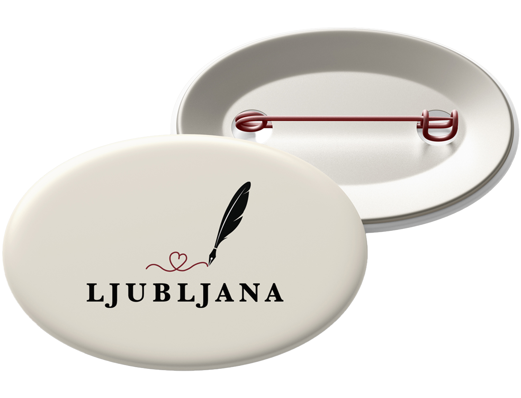
Inspired by Ljubljana’s literary heritage, the quill represents creativity and cultural depth. This direction highlights the city’s artistic identity and intellectual spirit.
The dragon is one of Ljubljana’s most recognizable symbols and carries strong historical and mythical meaning. This concept leans into boldness and immediate visual recognition.
Ljubljana Castle reflects the city’s history and architectural presence. This direction emphasizes structure, heritage, and a grounded sense of place.